pacman::p_load(
               DT,
               dtplyr,
               here,
               knitr,
               tidyverse,
               patchwork,
               metafor,
               orchaRd, ggalluvial, patchwork
)Alluvial plot
The alluvial plots below summarize the distribution of effect sizes across key study characteristics (e.g., outcome type, species/strain, sex, and exposure design variables).
NotePost-processing for the manuscript figure
The code here reproduces the alluvial plots and exports them as PDF/JPG.
For the final manuscript figure, we made minor edits in vector-graphics software (e.g., Illustrator/Inkscape) to improve readability—primarily manual repositioning of labels, spacing adjustments, and small layout tweaks. These edits do not change the underlying data or flows; they only improve figure legibility.
db <- readr::read_csv(here(
  "..","data","db_effect_sizes.csv")) %>%
mutate(across(c(C_n, Ex_n, C_mean, Ex_mean, C_SE, Ex_SE, C_SD, Ex_SD), as.numeric))%>%
  mutate(across(where(is.character), as.factor))
db_freq <- db %>%
# Group by all variables that define a unique flow path and the frequency count
group_by(Study_ID, Outcome_type, Species_latin, Strain, Sex) %>%
# Count the number of rows (observations) in each group
summarise(Freq = n(), .groups = 'drop')custom_colors <- c(
"Female" = "#1F78B4", # Deep Blue
"Male" = "#FF7F00", # Bright Orange
"Mixed" = "#A6A6A6" # Neutral Gray
)
# --- Plotting the Aggregated Data (db_freq) ---
Out_spp_strain<-ggplot(db_freq,
# Explicitly use the calculated Freq column for the flow height
aes(y = Freq,
axis1 = Outcome_type, axis2 = Species_latin, axis3 = Strain)) +
# 1. Flow and Transparency
geom_flow(color = "black",
aes(fill = as.factor(Sex)),
alpha = 0.3) +
# Add the strata boxes
geom_stratum() +
# 2. Adjust Strata Text (Labels)
geom_text(stat = "stratum",
aes(label = after_stat(stratum)),
size = 3,
discern = TRUE,
color = "black",
fontface = "bold",
vjust = 0.5) +
# 3. Apply Custom Color Palette
scale_fill_manual(
name = "Sex",
values = custom_colors
) +
labs(
title = "Study subjects")+
# 4. Axis Headings at the BOTTOM
annotate("text", x = 1, y = min(db_freq$Freq) * -0.1, label = "Outcome Type", fontface = "bold", vjust = 1) +
annotate("text", x = 2, y = min(db_freq$Freq) * -0.1, label = "Species", fontface = "bold", vjust = 1) +
annotate("text", x = 3, y = min(db_freq$Freq) * -0.1, label = "Strain", fontface = "bold", vjust = 1) +
# 5. Hide Axes and Clean Theme
scale_y_continuous(labels = NULL) +
theme(
plot.margin = margin(t = 5, r = 5, b = 25, l = 5, unit = "pt"),
axis.line.x = element_blank(),
axis.ticks.x = element_blank(),
axis.text.x = element_blank(),
axis.title.y = element_blank(),
axis.text.y = element_blank(),
axis.ticks.y = element_blank(),
panel.grid.major = element_blank(),
panel.grid.minor = element_blank(),
panel.background = element_blank()
)Out_spp_strain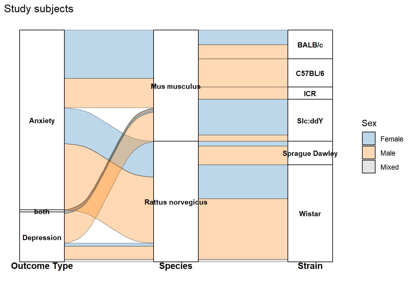
db_fixed_assay <- db %>%
  # Filter the data to ensure we only rename the categories we listed
  mutate(
    # Create a new, shortened column for the Assay Type labels
    Assay_initials = case_when(
      Assay_type == "Elevated Plus Maze" ~ "EPM",
      Assay_type == "Open Field Test" ~ "OFT",
      Assay_type == "Light-Dark Box" ~ "LDB",
      Assay_type == "Novelty Suppressed Feeding (NSF)" ~ "NSF",
      Assay_type == "Sucrose Preference Test (SPT)" ~ "SPT",
      Assay_type == "Forced Swim Test (FST)" ~ "FST",
      Assay_type == "Tail Suspension Test (TST)" ~ "TST",
      Assay_type == "Nest building" ~ "Nest",
      Assay_type == "Marble burying" ~ "MB",
      TRUE ~ Assay_type # Keep any other unlisted Assay_type names as they are
    )
  ) %>%
  # Group by the new axis variables and the flow variable (`Induced behaviour`)
  group_by(Study_ID, Lifestage_exposure, Music_exposure_duration, Assay_initials, `Induced behaviour`) %>%
  # Count the number of observations (Freq)
  summarise(Freq = n(), .groups = 'drop')

# --- 2. PLOTTING STEP ---
custom_colors <- c(
  "Innate" = "blue",
  "Induced" = "red"
)

assay_plot <- ggplot(db_fixed_assay,
       # Use Freq for flow height
       # Axis 3 is now Assay_initials
       aes(y = Freq,
           axis1 = Lifestage_exposure, axis2 = Music_exposure_duration, axis3 = Assay_initials)) +

  # 1. Flow and Transparency (alpha = 0.3)
  geom_flow(color = "black",
            aes(fill = as.factor(`Induced behaviour`)),
            alpha = 0.3) +

  # Add the strata boxes
  geom_stratum() +

  # 2. Adjust Strata Text (Labels) - Will now show the initials (EPM, SPT, etc.)
  geom_text(stat = "stratum",
            aes(label = after_stat(stratum)),
            size = 3,
            discern = TRUE,
            color = "black",
            fontface = "bold",
            vjust = 0.5) +

  # 3. Apply Custom Color Palette and Legend Title
  scale_fill_manual(
    name = "Behavioral Mechanisms",
    values = custom_colors
  ) +
  labs(
    title = "Music exposure"
  ) +

  # 4. Axis Headings at the BOTTOM
  # Axis 3 heading is changed to 'Assay Type'
  annotate("text", x = 1, y = min(db_fixed_assay$Freq) * -0.1, label = "Age", fontface = "bold", vjust = 1) +
  annotate("text", x = 2, y = min(db_fixed_assay$Freq) * -0.1, label = "Duration", fontface = "bold", vjust = 1) +
  annotate("text", x = 3, y = min(db_fixed_assay$Freq) * -0.1, label = "Assay Type", fontface = "bold", vjust = 1) +

  # 5. Hide Axes and Clean Theme
  scale_y_continuous(labels = NULL) +
  theme(
    plot.margin = margin(t = 5, r = 5, b = 25, l = 5, unit = "pt"),
    axis.line.x = element_blank(),
    axis.ticks.x = element_blank(),
    axis.text.x = element_blank(),
    axis.title.y = element_blank(),
    axis.text.y = element_blank(),
    axis.ticks.y = element_blank(),
    panel.grid.major = element_blank(),
    panel.grid.minor = element_blank(),
    panel.background = element_blank()
    )
assay_plot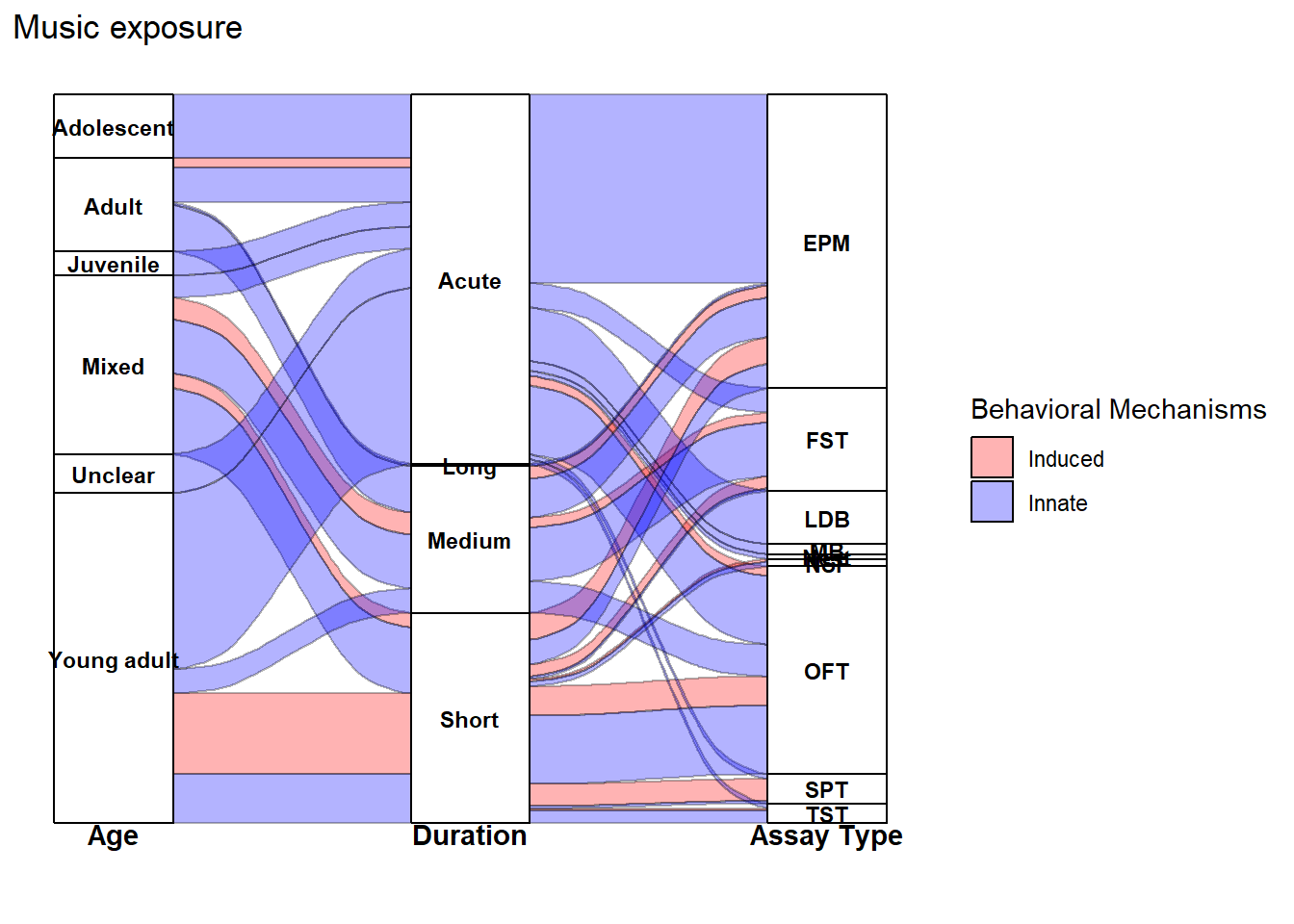
plot1<-(Out_spp_strain/assay_plot)+ plot_annotation(
    tag_levels = 'A'
)ggsave(filename = here("..","Plots", "alluvial_raw.pdf"),
plot = plot1,
dpi = 300, device = cairo_pdf, width = 12,
height = 15)
ggsave(filename = here("..","Plots", "alluvial_raw.jpg"),
plot = plot1,
width = 12,
height = 15,
dpi = 300)
Note
sessionInfo()R version 4.5.2 (2025-10-31 ucrt)
Platform: x86_64-w64-mingw32/x64
Running under: Windows 11 x64 (build 26200)
Matrix products: default
LAPACK version 3.12.1
locale:
[1] LC_COLLATE=English_Guernsey.utf8 LC_CTYPE=English_Guernsey.utf8
[3] LC_MONETARY=English_Guernsey.utf8 LC_NUMERIC=C
[5] LC_TIME=English_Guernsey.utf8
time zone: America/Edmonton
tzcode source: internal
attached base packages:
[1] stats graphics grDevices utils datasets methods base
other attached packages:
[1] ggalluvial_0.12.5 orchaRd_2.1.3 metafor_4.8-0
[4] numDeriv_2016.8-1.1 metadat_1.4-0 Matrix_1.7-4
[7] patchwork_1.3.2 lubridate_1.9.4 forcats_1.0.1
[10] stringr_1.6.0 dplyr_1.1.4 purrr_1.2.1
[13] readr_2.1.6 tidyr_1.3.2 tibble_3.3.1
[16] ggplot2_4.0.1 tidyverse_2.0.0 knitr_1.51
[19] here_1.0.2 dtplyr_1.3.2 DT_0.34.0
loaded via a namespace (and not attached):
[1] generics_0.1.4 stringi_1.8.7 lattice_0.22-7
[4] hms_1.1.4 digest_0.6.39 magrittr_2.0.4
[7] evaluate_1.0.5 grid_4.5.2 timechange_0.3.0
[10] RColorBrewer_1.1-3 fastmap_1.2.0 rprojroot_2.1.1
[13] jsonlite_2.0.0 scales_1.4.0 textshaping_1.0.4
[16] cli_3.6.5 crayon_1.5.3 rlang_1.1.7
[19] bit64_4.6.0-1 withr_3.0.2 yaml_2.3.12
[22] otel_0.2.0 parallel_4.5.2 tools_4.5.2
[25] tzdb_0.5.0 mathjaxr_2.0-0 pacman_0.5.1
[28] vctrs_0.7.1 R6_2.6.1 lifecycle_1.0.5
[31] bit_4.6.0 htmlwidgets_1.6.4 vroom_1.7.0
[34] ragg_1.5.0 pkgconfig_2.0.3 pillar_1.11.1
[37] gtable_0.3.6 data.table_1.18.2.1 glue_1.8.0
[40] systemfonts_1.3.1 xfun_0.56 tidyselect_1.2.1
[43] rstudioapi_0.18.0 farver_2.1.2 nlme_3.1-168
[46] htmltools_0.5.9 labeling_0.4.3 rmarkdown_2.30
[49] compiler_4.5.2 S7_0.2.1